

Say hello to Hampr’s new logo!
February 21 • 3 min read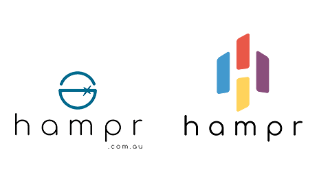
Today is an exciting day as we transition to launching a new logo. As our business grows, so do the services and offerings we bring to our customers.
We thought that it would make a lot of sense to re-brand ourselves based on the trajectory we are heading, as well as representing the vision we have for Hampr.
Don’t get me wrong, we really loved our original logo and it took a lot of back-forth conversations to decide to evolve. However as we continue to offer more quality services to you, it is important to re-evaluate our brand to reflect the new verticals we are bringing onboard. Let us explain the reason for this evolution.
Firstly, Hampr started off as a marketplace that saves you time and effort when making corporate purchases such as food, drinks & office catering. We have since evolved to being a centralised platform (incorporated with workflow tools), designed for office managers and receptionists to utilise for all office purchases.
Today, we are building additional offerings including service staff (i.e. cleaners, baristas, waiters & cocktail makers), event space, corporate merchandise and other items such as corporate gifts, flowers and office decorations etc.
Throughout the design process of creating our new logo, there were a set number of requirements needed, which entailed:
- A logo that represents the new verticals we have on offer.
- Represent a platform specifically targeted to our True-North Customer — Corporate offices.
- Create a brand that will stay true years to come.
- Implement the use of vibrant colours that can be associated with new verticals.

Off to the drawing board we went…through a number of different logo designs, to different variations in colour, with many internal discussions over the course of a month, we had to ensure that it was a logo that the team had agreed on, and could be something they felt excited to represent.
We wanted to create a logo that could be used across a number of colours, and so it was important to use vivid colours which represents each vertical we support (as a pillar).

Our final decision was based upon the following 4 considerations:
Each block of colour represents a vertical (or pillars) that Hampr will service.
The logo as a whole represents the corporate landscape (our True-North customer). The use of negative space creates the ‘H’, which is Hampr — The centralised platform that connects corporates to each pillar.
The simplicity of the logo allows it to reflect where we are today, but also provide room to represent the vision of where Hampr will be 5 years down the track (less is more).
The specific colours used allows the logo to be used on a variety of backgrounds. Each colour is also very distinct which represents each of our offerings very easily.
So here it is, our brand new logo!

Over the next few months, you will see a lot of visual changes to help us align to our new vision and direction. These changes will be consistent throughout our website, online advertising as well as email headers. Keep in mind, that we are the same Hampr you have always known, and we strive to make your work life as easy and efficient as we can, and become a tool that you use for life.
Thanks for supporting us!
The Hampr Team.
- Design
- Rebranding
- Logo Design
- Vision
- Goals
- Journey